1) Look at the Tatler Media Pack. Go to page 2: how does the editor introduce the magazine?
She introduces it by sayings its an accurate rifle shot, saying that its very exclusive and almost an achevement to own a tatler magazine.
2) Now go to page 4 of the Media Pack. Focus on the print magazine (NOT tatler.com - the website). List the key demographic details: age, gender %, ABC1 % (social class), HHI (Household Income), % of those living in London and the South East. What do these demographic details suggest about the average Tatler reader?
average age: 41
2) Tatler runs special issues on holidays, spa breaks, cosmetic surgery, watches and jewellery and private schools. What does this suggest about the magazine's representation of life in Britain?
gender percentage: 70% female
ABC1: 80%
HHI: 261,572£
London/SE: 70%
3) Look at page 6. What do Tatler readers think about fashion? How much do they spend?
The tatler audience mainly own designer fashion which shows they are rich and that they think you have to have designer if you wan to be classed as posh. They spent 843 million pounds on fashion.
4) Go to page 10. What are the special editions of Tatler that run throughout the year? What does this suggest about the Tatler audience? What about the pyschographic audience group that best fits Tatler?
The guides are travel, weddings, plastic surgery, spa , jewelry, and school.This suggested the tattler audience are often using advice from the magazines as half of the year they are special editions.
Media language
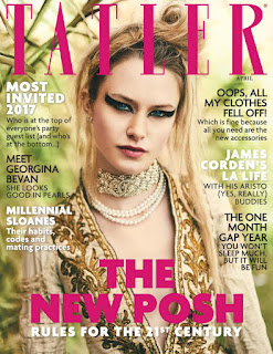
Revise the 12 magazine cover key conventions and check how many feature on this edition of Tatler.
1) What different examples of typography can you find on the cover of Tatler? What are the connotations of the serif and sans serif fonts? Here's a blog to help you with this as we haven't been able to complete the Photoshop typography lesson yet due to Covid-19.
2) How do the cover lines appeal to the Tatler target audience?
The colours stand out so its easily readable by the audience.
Media language
Revise the 12 magazine cover key conventions and check how many feature on this edition of Tatler.
1) What different examples of typography can you find on the cover of Tatler? What are the connotations of the serif and sans serif fonts? Here's a blog to help you with this as we haven't been able to complete the Photoshop typography lesson yet due to Covid-19.
The font choice is serif which shows they have a more traditional and posh audience but there is also sans serif for 'the new posh'.
The colours stand out so its easily readable by the audience.
3) What are the connotations of the Tatler colour scheme on this particular front cover?
The colour scheme is very feminine and girly as there is a large female audience so it appeals to them.
4) How is the central image designed to create interest in the magazine? Find three reasons for your answer. (E.g. Mise-en-scene such as props, costume and make-up, body position, facial expression)
4) How is the central image designed to create interest in the magazine? Find three reasons for your answer. (E.g. Mise-en-scene such as props, costume and make-up, body position, facial expression)
She is wearing pearls which are expensive. The make up is heavily applied and therefore will easily catch the eye of the audience.
Representations
1) What different groups of people are represented on the cover? (E.g. men/women/white people etc. Look at the image and text/cover lines to help here)
Representations
1) What different groups of people are represented on the cover? (E.g. men/women/white people etc. Look at the image and text/cover lines to help here)
Celebrities and models are represented aka James corden which is done so fans of these people will read the magazine.
2) What do the cover lines suggest about the lifestyle of rich people in the UK?
The coverlines could show that they are somewhat modern as it says "THE NEW POSH"
3) Are there any stereotypes being reinforced or subverted? How? Why?
A stereotype that is reinforced is the fact that posh people only wear designer beacuse they have alot of money, and the model is weraing pearls, which are a form of expensive jewelry
3) Are there any stereotypes being reinforced or subverted? How? Why?
A stereotype that is reinforced is the fact that posh people only wear designer beacuse they have alot of money, and the model is weraing pearls, which are a form of expensive jewelry
4) What would be the preferred and oppositional readings to this cover of Tatler?
The preffered reading of the cover is that beauty comes if you are intensely made up and if you are wealthy enough to afford the finest and nothing but the finest. The oppositional reading would be that the best isnt required and individuals are naturally beautiful.
Social and cultural context
1) What aspects of British life or people are NOT reflected in Tatler? (Watch the clip above again if you need help with this - the clue is in the title 'Posh People')
1) What aspects of British life or people are NOT reflected in Tatler? (Watch the clip above again if you need help with this - the clue is in the title 'Posh People')
The ones in poverty as this a posh lifestyle magazine and it doesnt relect the middle class or working class
2) Tatler runs special issues on holidays, spa breaks, cosmetic surgery, watches and jewellery and private schools. What does this suggest about the magazine's representation of life in Britain?
The magazines representation of Britaian is posh and that only the best exists in englisnd when in reality alot of working class live in the UK.
3) What audience groups might be offended or insulted by the front cover of Tatler April 2017?
3) What audience groups might be offended or insulted by the front cover of Tatler April 2017?

